Regular
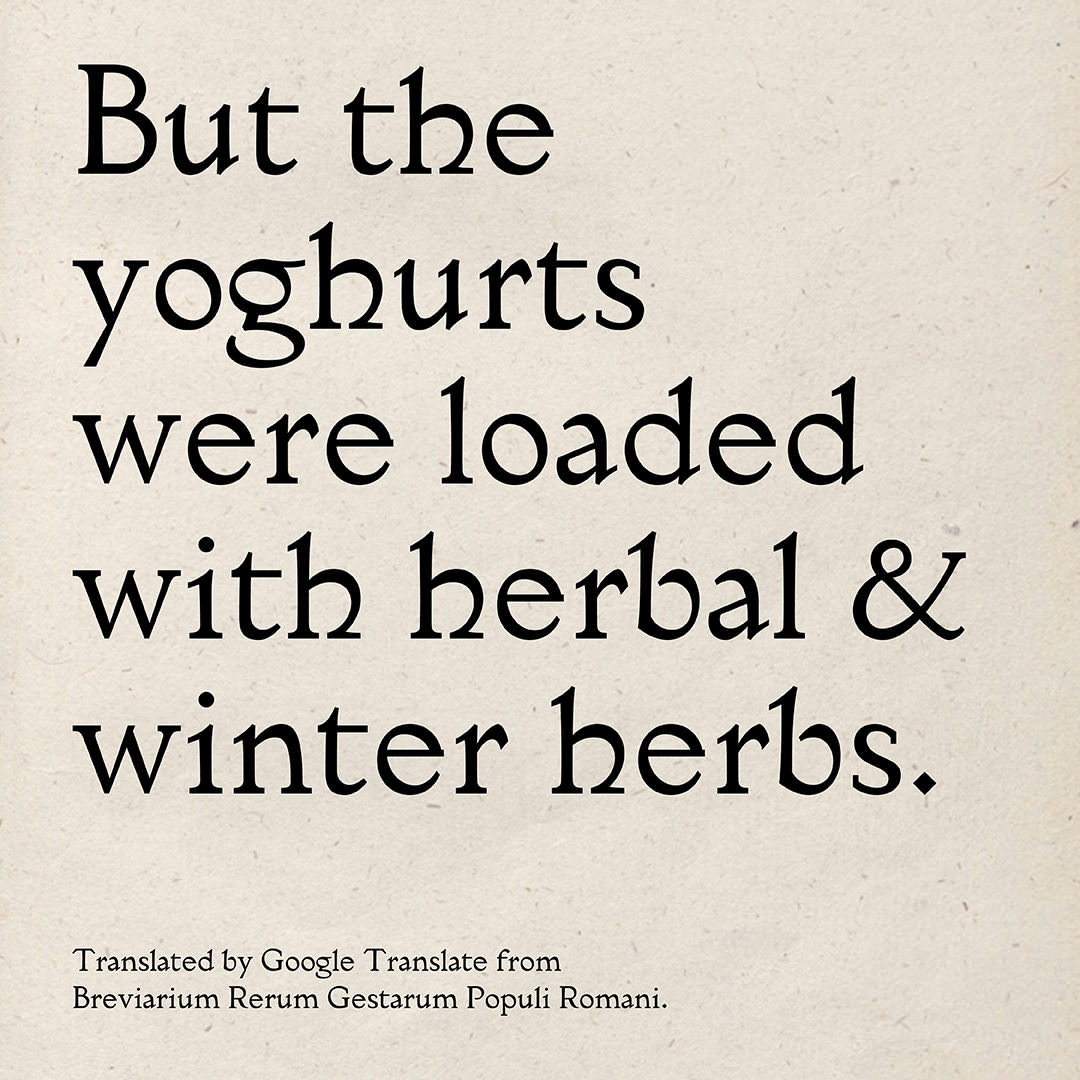
But the yoghurts were loaded with herbal & winter herbs.
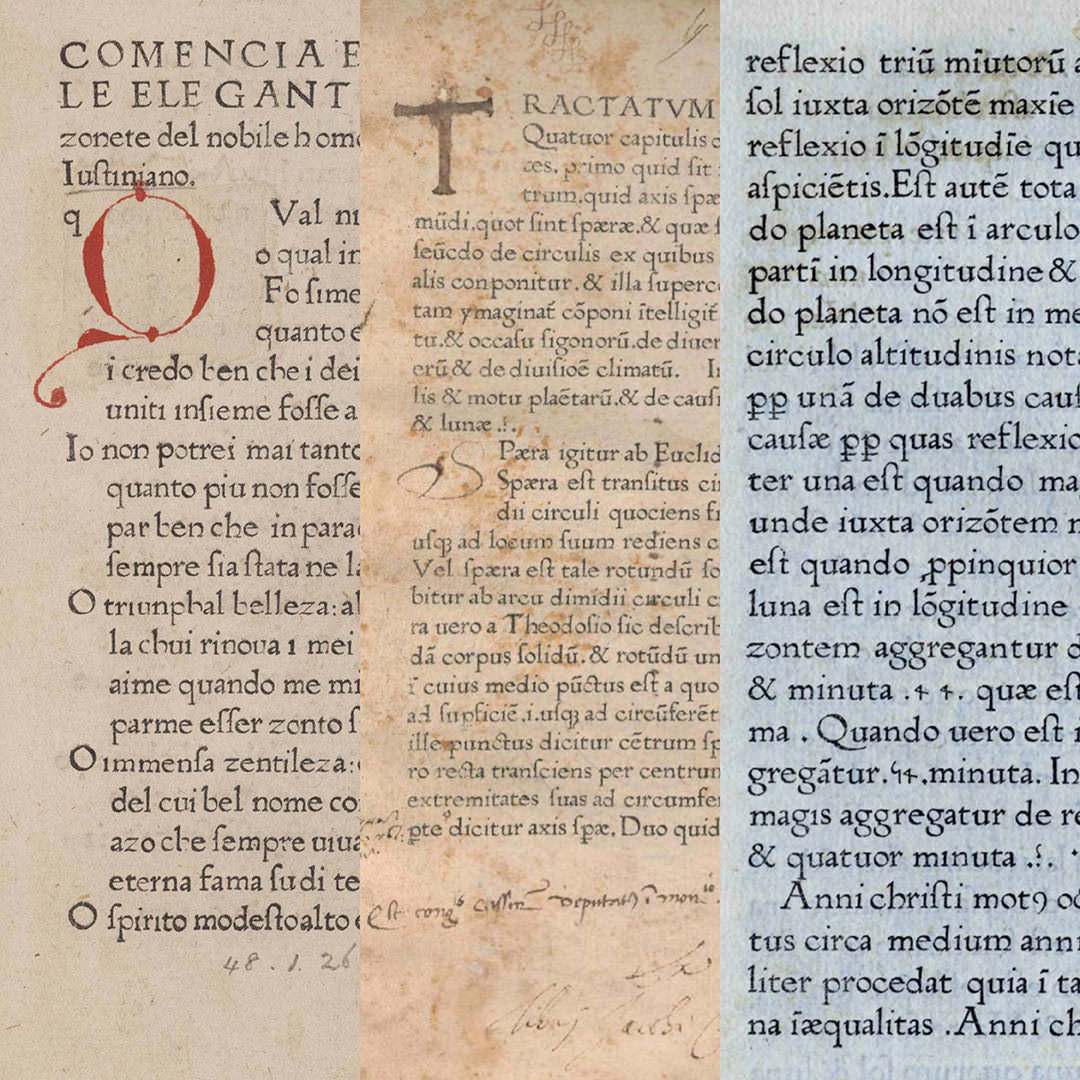
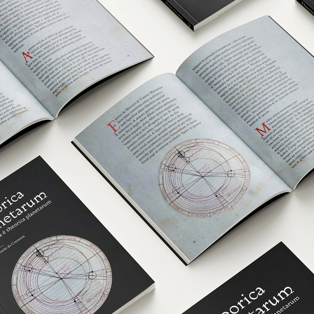
Gautina is a revival project is based on type found in book printed in 1472 by Florentius de Argentina in Venice. Initially I thought the type might be by Nicholas Jenson, but digging deeper it turned out to be made by Adam Ambergau.
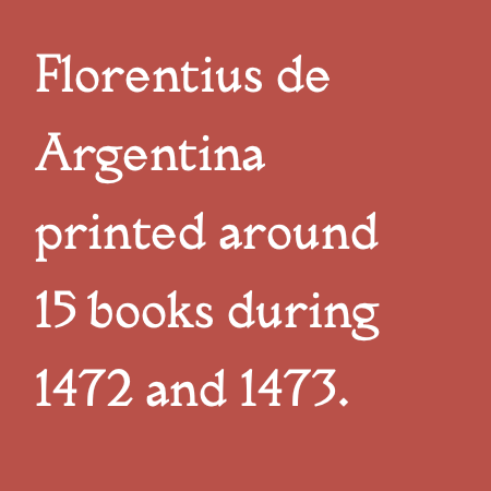
As a printer he used type by Jenson for some years, until he decided to cast his own. He printed one book with it, then went bust. However his type was picked up by other Venetian printers who — for the most part — liked the look of it. Florentius de Argentina was one of those printers. He repunched the lowercase o — Ambergau’s slanted the other way — and printed around 15 books with it during 1472 and 1473.
I found seven of them online to use as source material. I chose this type for some of the lovely features: the pleasant roundness, the large open counters, the little kicks of the h, m and n, the determined accents and this delightful lowercase g. The name Gautina is derived from the names of Ambergau and de Argentina.


But the yoghurts were loaded with herbal & winter herbs.
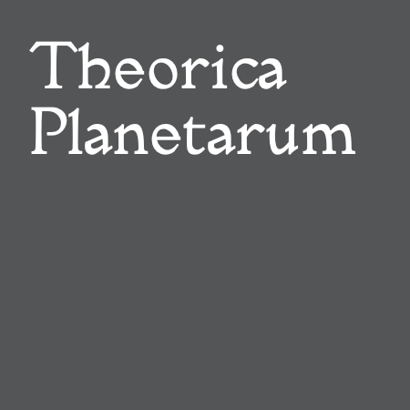
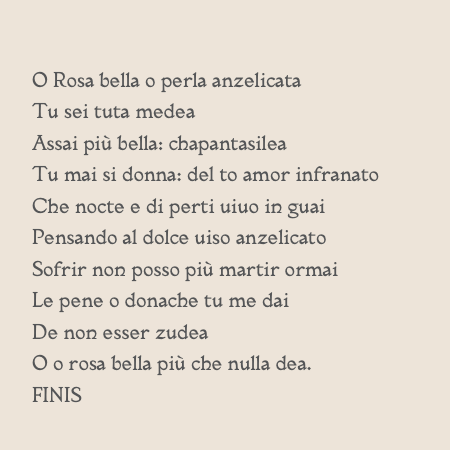
Expleta é theorica planetarum
Theorie der Planeten
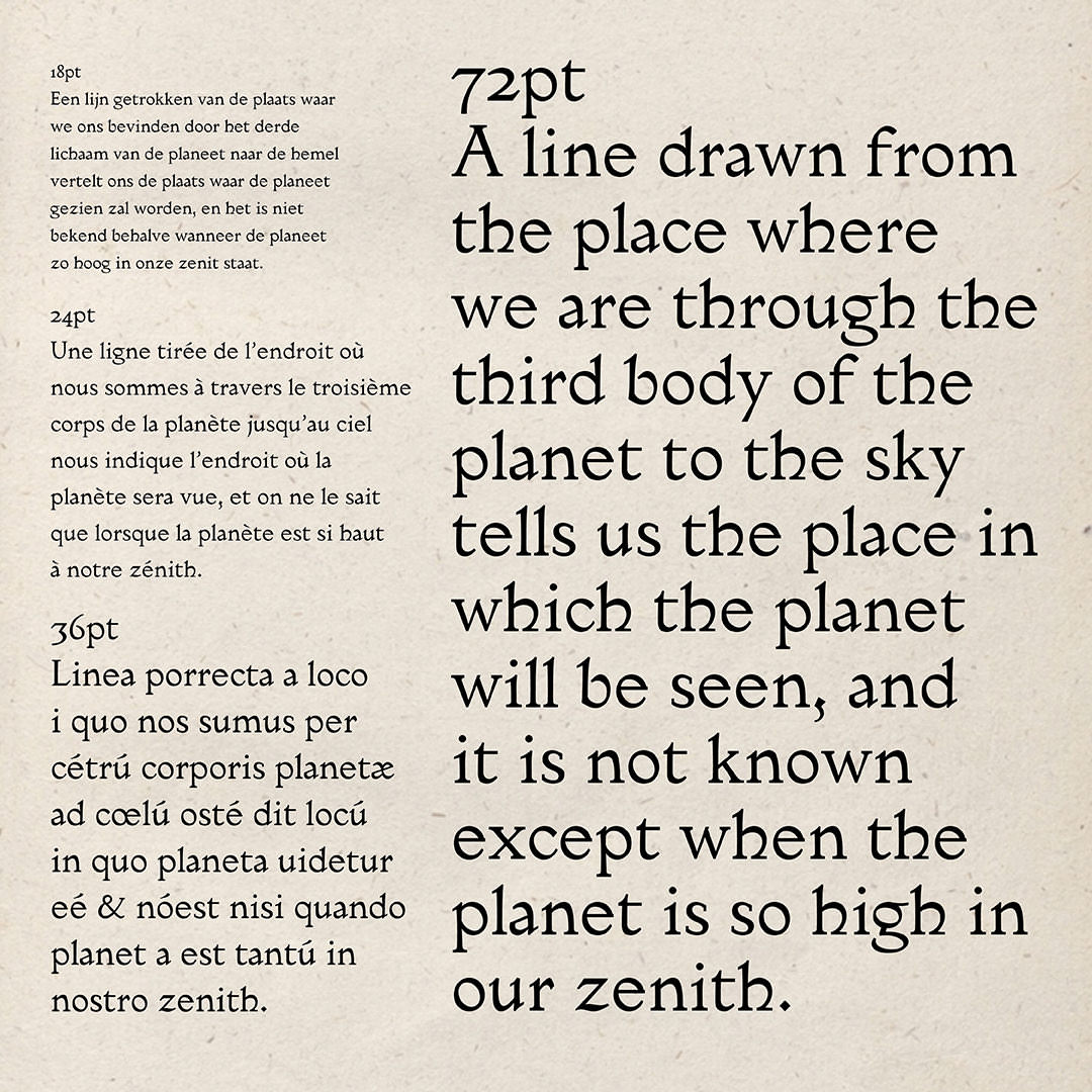
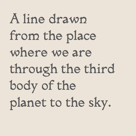
Eine Linie, die von dem Ort, an dem wir uns befinden, durch den dritten Körper des Planeten zum Himmel gezogen wird, zeigt uns den Ort, an dem der Planet zu sehen sein wird, und es ist nicht bekannt, außer wann der Planet so hoch in unserem Zenit steht.
Théorie des planètes
Une ligne tirée de l’endroit où nous sommes à travers le troisième corps de la planète jusqu’au ciel nous indique l’endroit où la planète sera vue, et on ne le sait que lorsque la planète est si haut à notre zénith.
Theorica Planetarum
Linea porrecta a loco i quo nos sumus per cétrú corporis planetæ ad cœlú osté dit locú in quo planeta uidetur eé & nóest nisi quando planet a est tantú in nostro zenith.
Theorica Planetarum
Theorica Planetarum
Theorica Planetarum
Regular, Italic, Bold
otf, woff, woff2
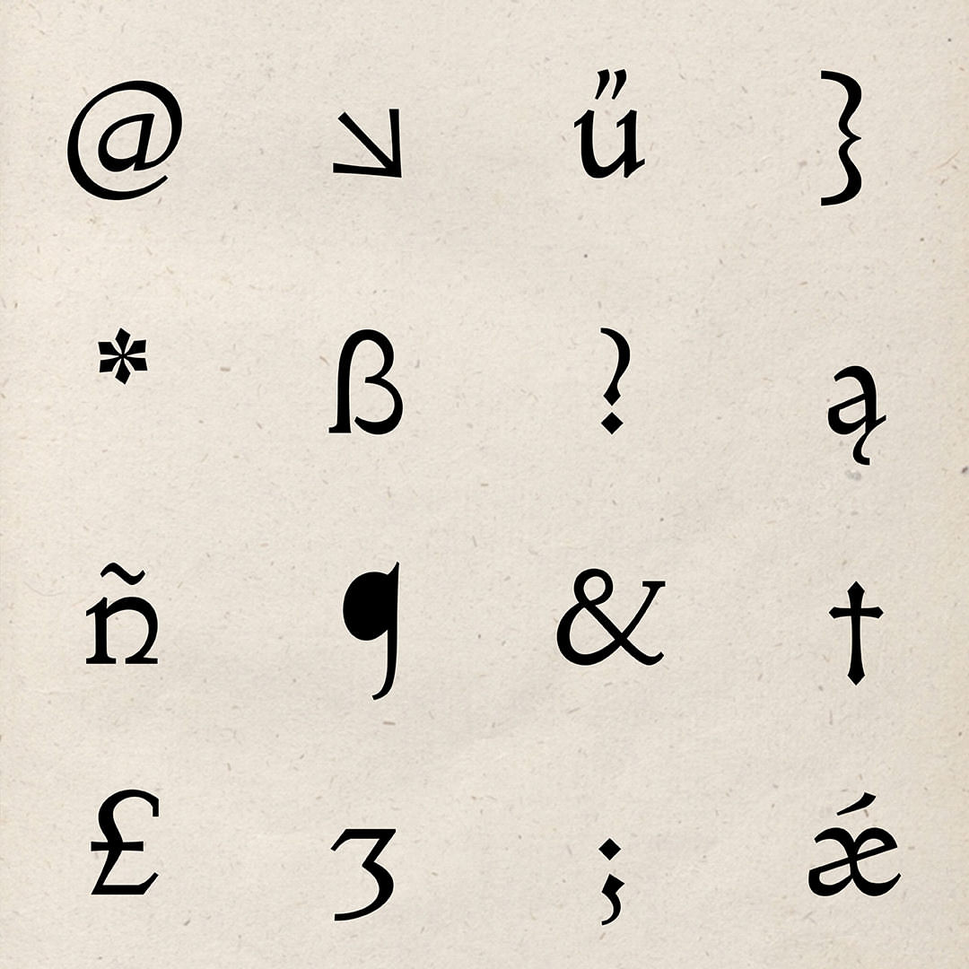
Contextual alternates, Case sensitive forms, Glyph composition/decomposition, Discretionary ligatures, Historical ligatures, Lining figures, Localized forms, Oldstyle figures, Ordinals, Superscript, Kerning, Mark to base positioning, Mark to mark positioning
Latin up to a point